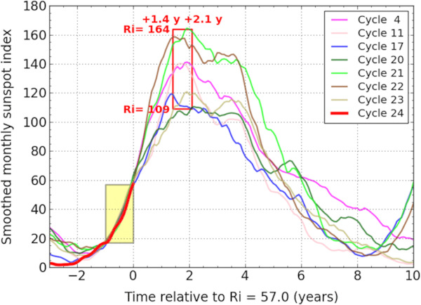
Fig. 11

Download original image
Superposed-epoch plot of all the cycles since cycle 1 that best match the early rise of cycle 24 (red thick curve) over the 12 months before the July 2011 tie point (origin of the horizontal relative time axis). The overlaid red rectangle frames the ranges of amplitudes and times of maxima for all matching cycles. This gives the actual range of past cycle evolutions compatible with the current rise profile, which was rather steep in 2010–2011.
Current usage metrics show cumulative count of Article Views (full-text article views including HTML views, PDF and ePub downloads, according to the available data) and Abstracts Views on Vision4Press platform.
Data correspond to usage on the plateform after 2015. The current usage metrics is available 48-96 hours after online publication and is updated daily on week days.
Initial download of the metrics may take a while.


