Fig. 6
Download original image
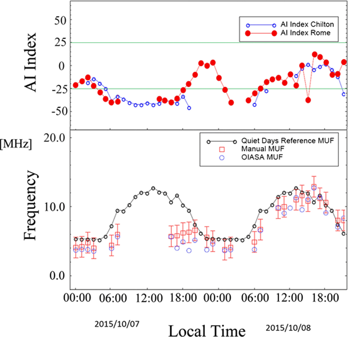
The plot in the lower panel shows the results of the comparison between automatic scaling and manual scaling of the ionograms recorded on October 7 and 8, 2015. The red open squares indicate the MUF measured by the operator, and the red error bars indicate the range of ±1.5 MHz from the manually scaled MUF. Blue circles indicate the OIASA estimates of the MUF, whose values are considered acceptable if located within the error bars. The black line represents the average manual MUF values, considering a week before and a week after the two ionospheric disturbed days and refers to the quiet-time daily variation. The upper panel depicts the trend of the AI index of the ionospheric stations of Rome and Chilton, recorded in the days considered.
Current usage metrics show cumulative count of Article Views (full-text article views including HTML views, PDF and ePub downloads, according to the available data) and Abstracts Views on Vision4Press platform.
Data correspond to usage on the plateform after 2015. The current usage metrics is available 48-96 hours after online publication and is updated daily on week days.
Initial download of the metrics may take a while.