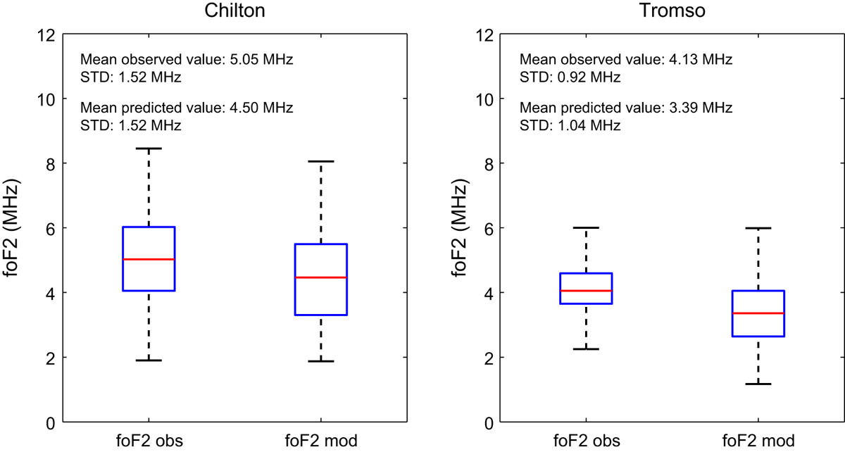
Fig. 8.

Download original image
The distributions of SWIF’s predictions and actual observations over Tromso and Chilton in a box plot format. This includes a box and whisker plot for each case. The box has lines at the lower quartile, median (red line), and upper quartile values. Whiskers extend from each end of the box to the adjacent values in the data; in our case to the most extreme values within 1.5 times the interquartile range from the ends of the box. Outliers (i.e., data with values beyond the ends of the whiskers) are not displayed for visualization purposes. The figure includes also the estimates of the mean observed and mean predicted values and the standard deviations in each case in order to provide a comprehensive statistical overview of the results.
Current usage metrics show cumulative count of Article Views (full-text article views including HTML views, PDF and ePub downloads, according to the available data) and Abstracts Views on Vision4Press platform.
Data correspond to usage on the plateform after 2015. The current usage metrics is available 48-96 hours after online publication and is updated daily on week days.
Initial download of the metrics may take a while.


