Fig. 8
Download original image
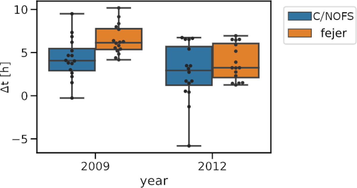
Boxplot showing the distribution of time differences between maximum bubble detection and maximum growth rate. Blue boxes correspond to C/NOFS driven growth rates, while orange boxes correspond to Fejer–Scherliess driven growth rates. The boxes on the left show the distribution during 2008/2009, while the box on the right shows the distribution during 2011/2012. The box extent is one quartile from the median, while the whiskers extend to the fourth quartile. Each black circle marks the time difference for one season/zone sector.
Current usage metrics show cumulative count of Article Views (full-text article views including HTML views, PDF and ePub downloads, according to the available data) and Abstracts Views on Vision4Press platform.
Data correspond to usage on the plateform after 2015. The current usage metrics is available 48-96 hours after online publication and is updated daily on week days.
Initial download of the metrics may take a while.