Figure 6

Download original image
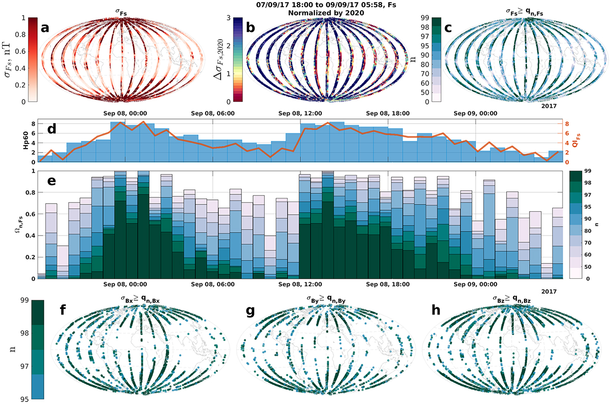
Hazard variation plots for the first peak of the 7–8th September 2017 storm using Swarm B Level1b OPER data. (a) plots the magnetic field intensity variation ![]() over the time period. (b) shows
over the time period. (b) shows ![]() i.e. panel (a) normalized by the mean magnetic variation of 2020. (c) plots the exceedance of the quantiles
i.e. panel (a) normalized by the mean magnetic variation of 2020. (c) plots the exceedance of the quantiles ![]() where the colour scheme reflects if
where the colour scheme reflects if ![]() . (d) and (e) are as in Figure 5, except each timepoint represents when Swarm B passes between ±75° latitude and (d) over plots Hp60 to better match the cadence of these orbit segments. (f) and (g) are of the form of (c) but for the components Bx, By and Bz, respectively. They only show the exceedance of the highest quantiles (n ≥ 95).
. (d) and (e) are as in Figure 5, except each timepoint represents when Swarm B passes between ±75° latitude and (d) over plots Hp60 to better match the cadence of these orbit segments. (f) and (g) are of the form of (c) but for the components Bx, By and Bz, respectively. They only show the exceedance of the highest quantiles (n ≥ 95).
Current usage metrics show cumulative count of Article Views (full-text article views including HTML views, PDF and ePub downloads, according to the available data) and Abstracts Views on Vision4Press platform.
Data correspond to usage on the plateform after 2015. The current usage metrics is available 48-96 hours after online publication and is updated daily on week days.
Initial download of the metrics may take a while.


