Figure 11
Download original image
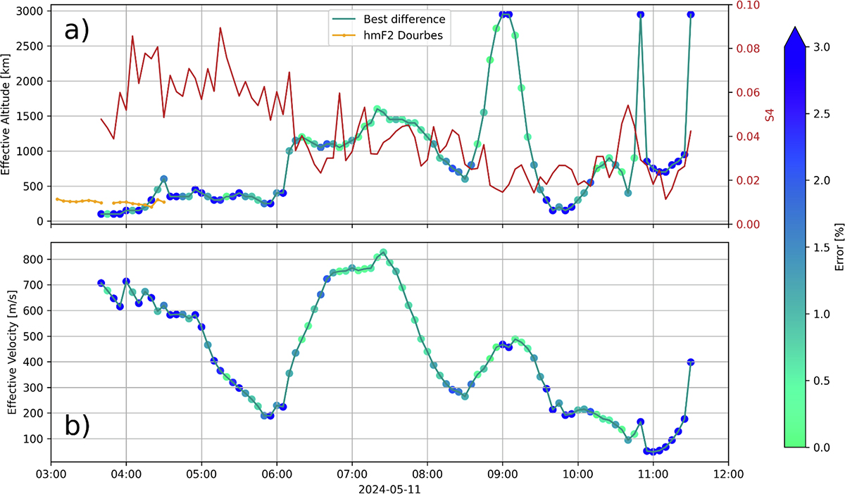
In panel a), the green line represents the effective altitude reconstructed by the comparison of the cross-correlation and Fresnel algorithms for the velocity reconstruction. The color of the scatter plots represents the relative percentage error between the two velocity methods. The comparison is done with the velocities measured using the 140 MHz data, as reported in the plot title. S4 values, measured at the same frequency, are also shown as a red line. Panel b) shows the velocity obtained by the cross-correlation method, measured at the effective altitude. The color of the scatter plots represents the relative percentage error between the two velocity methods.
Current usage metrics show cumulative count of Article Views (full-text article views including HTML views, PDF and ePub downloads, according to the available data) and Abstracts Views on Vision4Press platform.
Data correspond to usage on the plateform after 2015. The current usage metrics is available 48-96 hours after online publication and is updated daily on week days.
Initial download of the metrics may take a while.